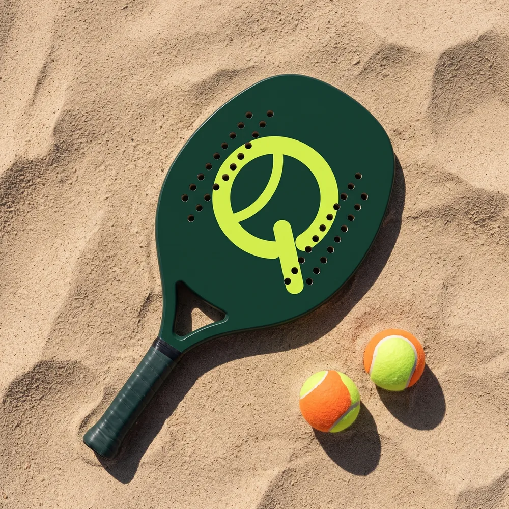
A Q that is a ball, and a ball that is a Q.
The symbol brings three things together: the letter that starts the name, the beach tennis ball and its seam. The tail is the only straight line, and it points to the court. Click the steps to see how it was built.
Four versions, one rule: contrast.
Use the symbol alone when the name is already nearby, like in the app or on a cap. On light backgrounds the brand is green. On dark backgrounds, lime. Never both together on a weak background.
Clear space
Leave a space around the brand equal to the height of the Q's tail. Nothing goes in there: no text, border or other logo.
Minimum size
The symbol works down to 16 px on screen and 6 mm in print. Below that, the seam disappears.
Court green, ball lime.
Two colors make the brand. Sand and ink give it room to breathe and carry the text. Hover to see the variations and click to copy the code.
Sora, from thin to bold.
A single family with variable weight. Headings in Semibold with tight spacing; body text in Regular. Write on the whiteboard to test it.
ABCDEFGHIJKLMNOPQRSTUVWXYZ abcdefghijklmnopqrstuvwxyz 0123456789 àéíõç @#&!?
The seam becomes a print.
The pattern repeats the ball's seam on a grid. Use it on backgrounds, packaging and uniforms. Adjust the scale, rotation and colors, then download the SVG.
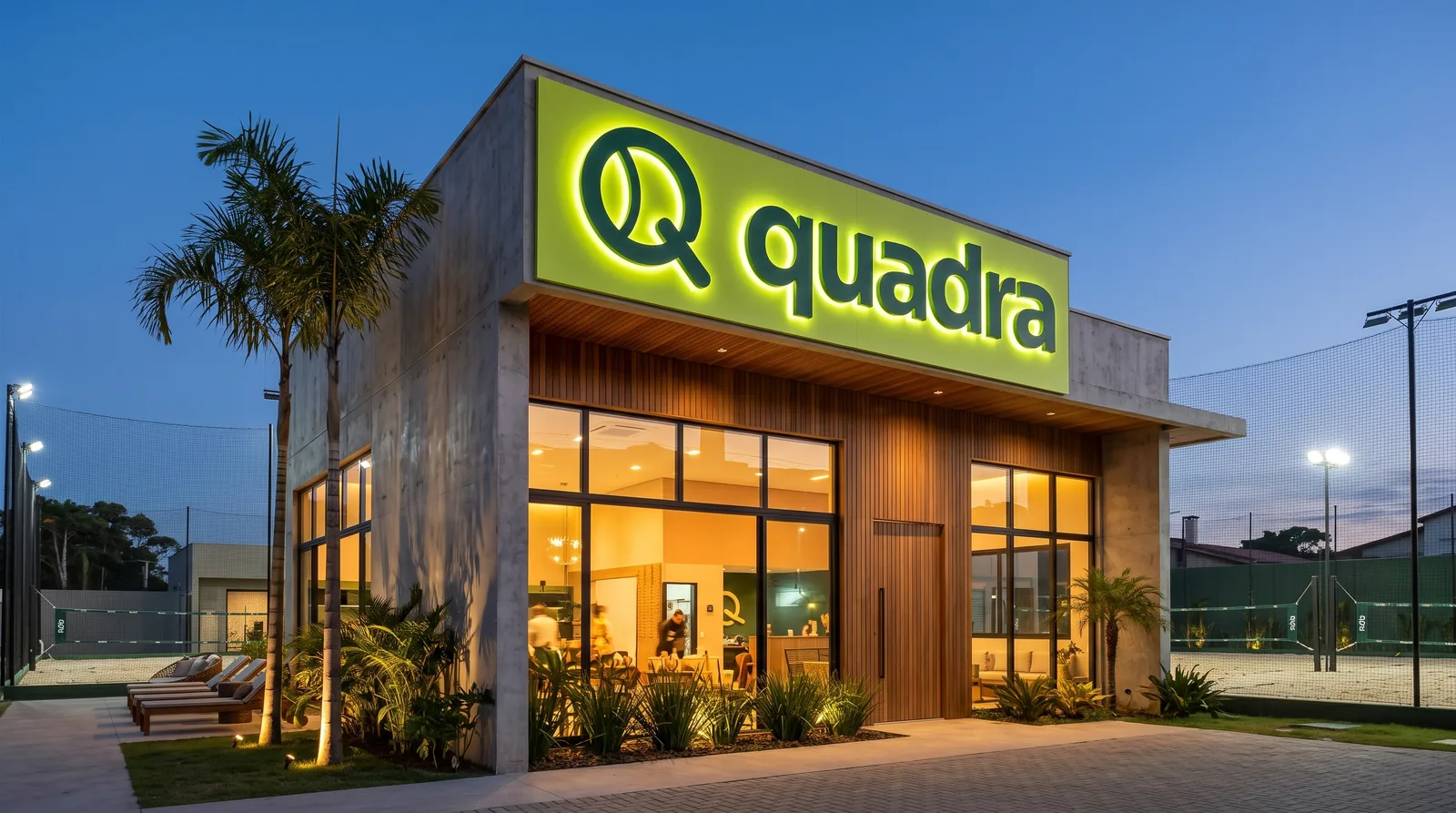
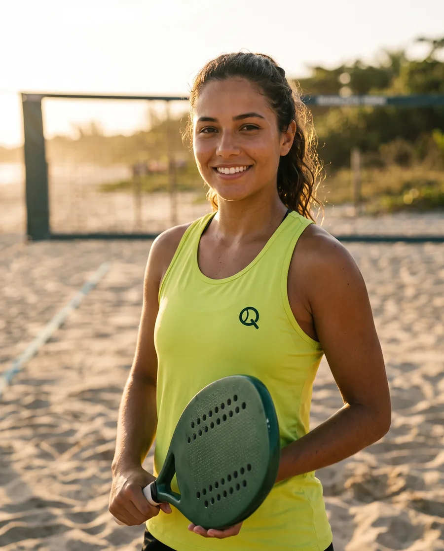
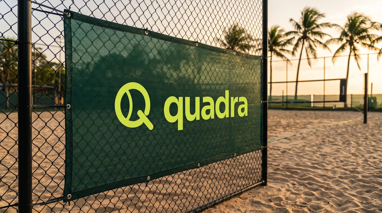
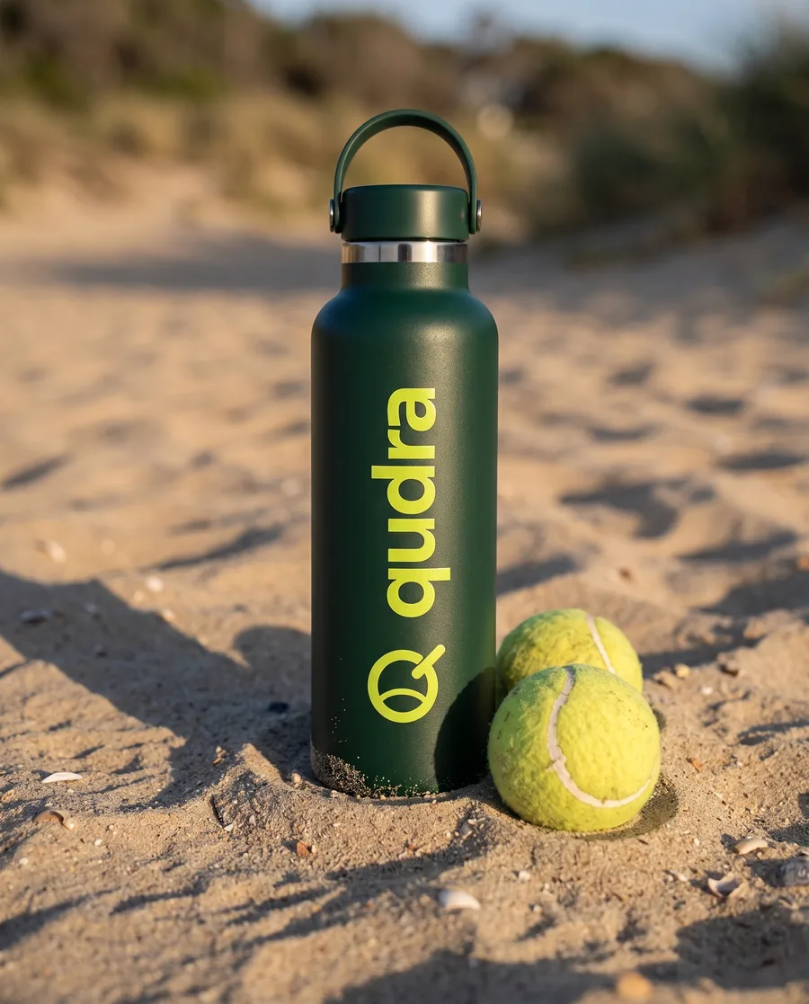
From the cap to the storefront.
Free trial class every Tuesday
Book on WhatsApp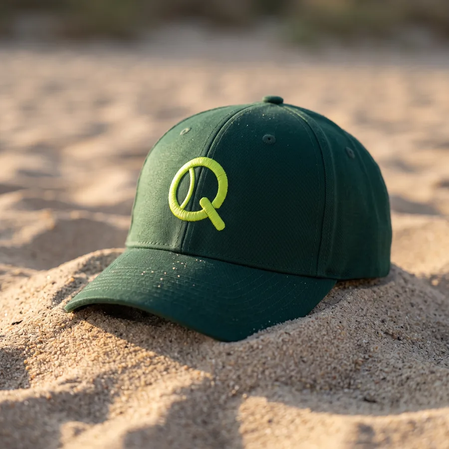
marina@quadra.club
We talk like someone who plays alongside you: direct, upbeat and free of jargon. An invite is “wanna play?”. The sand belongs to everyone.
Like this
Your first class is on us. We lend the racket and ball. Just bring sunscreen.
Not like this
Book your premium sports experience at our high-end facilities today.